Templates are the best way for beginners to start designing banner ads. Canva includes free templates which can be easily adapted to create your designs.
Canva templates make it super easy for complete beginners to design an ad for sports broadcasts. (To make things even easier, we fully recommend installing Canva on your computer if you haven't already.)
Canva comes with lots of free design templates for digital ads. It doesn’t have templates in LIGR’s specific ad sizes, but it does have leaderboard templates that are a very close fit. The leaderboard is one of the most common digital banner ad sizes (728x90 pixels).
You can start with a leaderboard template, and then in the next post in this series, we’ll run through how you can quickly convert your leaderboard into a LIGR compatible ad size, then use that as a basis to create your ad set of seven sizes.
Once you’ve gathered all your assets, open the Canva home screen, type “leaderboard ad” into the search box, and select “Leaderboard Ad.”
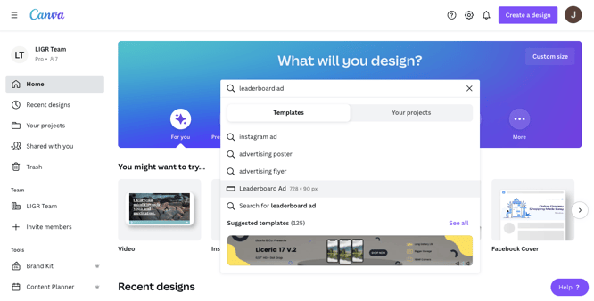
Using Canva's search tool to find a template
Remember that ads on LIGR aren’t clickable, so they don’t include buttons that you can click on, like: “SHOP NOW.” It’s best to choose templates without buttons or ones where the button can be easily removed. Most will be fine, but the button is integral to the design for some designs.
I chose this template:

A typical Canva leaderboard template
It might not seem like the obvious choice for a LIGR ad, but I have ignored the color scheme (as that is easily changed) and chosen based on the simple flat design and space for a cropped image (many of Canva’s templates have an image filling the whole banner). I can easily imagine this template with a LIGR color scheme, fonts, and images, and I’m convinced it will fit with LIGR’s style.
If you aren’t confident jumping in and designing your banner from a template, it might be helpful if you first follow this guide using my Canva file and run through each step in the Canva app. You can access my Canva file here (includes each step saved separately on pages within a single file). Then once you’ve done this, you can repeat the steps for your banner design.
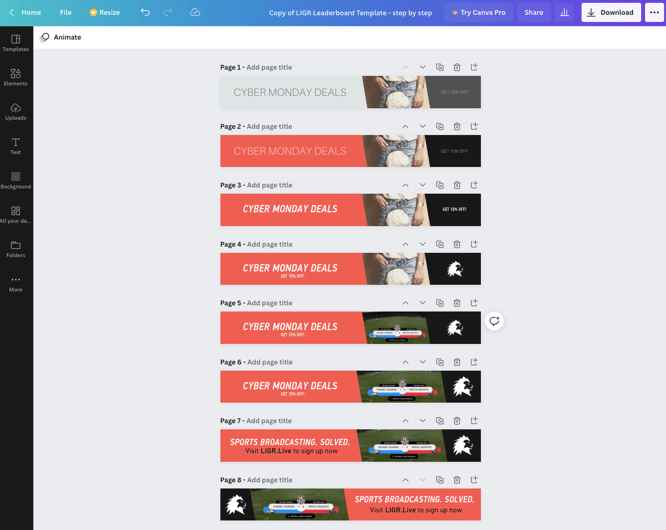
Adapting a Canva template step-by-step (access this file here)
The differences between an unprofessional and a professional-looking banner design are usually spacing, alignment, and balance. It’s like organizing furniture in your home. You wouldn’t just buy the biggest TV, sofa, and dining table available, squeeze them into a room and leave no space to walk in between. It’s the same with the elements that make up a banner (design “elements” are the different parts that make up a design, such as an image, a logo, a message).
A big logo is good, but you don’t want to make it too big so that it looks awkward and crammed in. Look at the space between each design element and make sure it has room to breathe. Look at ads from big brands like Nike, Adidas, Apple, Sony, or Coca-Cola. Or study the ads of the most famous brand in the same business sector as the ad you are designing. Look closely at the space between each design element. Creating professional-looking banners is all about space and alignment.
There are nine steps to reworking a Canva template into your design:
1. Rename your file
2. Use your assets file
3. Change the colors
4. Change the fonts
5. Add the logo
6. Replace the image
7. Replace the message
8. Add the action
9. Final tweaks
Good housekeeping is essential when creating banner ad sets. It’s easy to confuse files if you don’t name them correctly and keep them grouped in folders.
Rename your chosen template, including the name of your sponsor and “leaderboard template”:

Renaming a file in Canva
Then go to the “File” menu in Canva on the left of the blue bar at the top, select “Move to folder,” and then create a new folder for your ads that includes the name of your sponsor.
When you want to open your saved Canva files, you can access them from the Canva home screen. You won’t find them in your documents folder. The file is saved on Canva’s servers, as Canva is a web-based application. This also means you can log in to Canva on any device and immediately access your files.
Press the home icon in the top left of your Canva window to go to the home screen (your template file will stay open as a tab along the top of the window).
Find your assets file you created in Step 1 of this guide, hover over the image, press the three dots in the square next to it, and then move your assets file to the new folder you just created. Then click on your assets file to open it.
Select the logo and color palette squares and copy these items. Go back to your leaderboard template file, create a new page and paste your logo and colors. You can then maintain a color palette with more than the standard four colors allowed with a free Canva account.
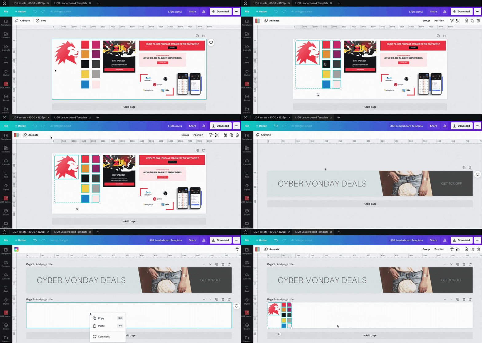
Copying and pasting between Canva files
You can now use the color picker to change the colors in your banner template file.
This template has five design elements: The “CYBER MONDAY DEALS” text; the light gray shape; the “GET 10% OFF!” text; the dark gray shape; and the image.
Within the Canva file, these elements are layered on top of one another, with the image at the back, the shapes in the middle, and the text in front – just like arranging items in a scrapbook. You can click on each element, which highlights the area around them and allows you to make changes.
Click on the light gray shape to highlight it. You can see that it’s a rotated rectangle. Click the small color square that appears top left and use the color picker to change the color.
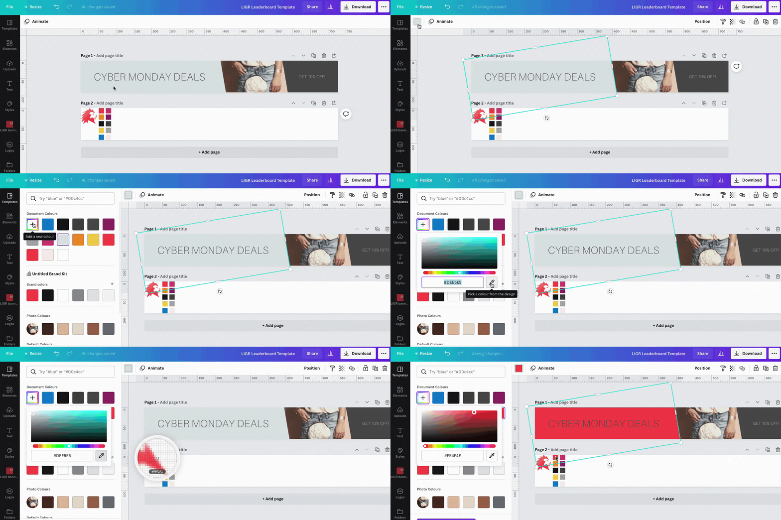
Using the color picker tool in Canva
Repeat this for the other shape and the text. To change text color, highlight the words you want to change and press the “A” with a color underline in the text editing menu at the top.
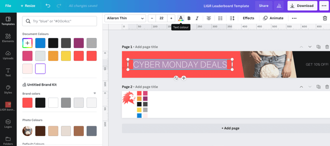
Changing the color of text in Canva
Click on the name of the current font at the top to open the font menu. As I mentioned before, keep it simple and choose a font that’s close to one used on the sponsor’s website. Try not to use more than two different fonts in one ad design.
If your sponsor has stipulated that you must use their corporate font, you will need a Canva pro account if the font isn’t already included in Canva. See how to upload fonts to Canva here.
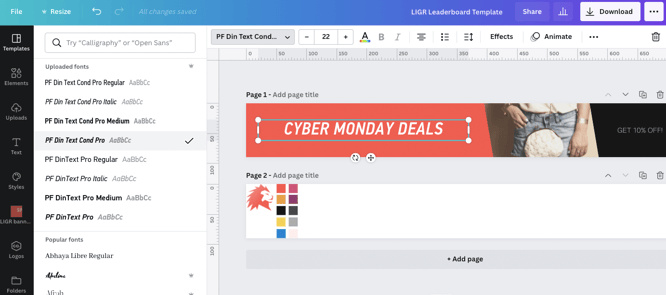
Changing the font in Canva
Most of Canva’s templates don’t include space for a logo, so you’ll need to make some room. I moved the text on the right and put the logo on top of the black shape.
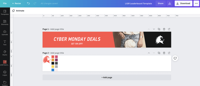
Adding a logo to a Canva template
I found a white version of the LIGR logo that looks better on the black background, so I used it instead of the red one in my assets file. This is why it’s good to collect alternatives when gathering your assets – it gives you options when you are designing.
I’m not really happy with the logo position right now. Left or top left is standard practice for logos in banner ads. People scan from left to right, and the logo should be on the left to introduce the company. I’m going to leave it for now, though. It's better to fix it once I have all my assets in place.
The red and black shapes are positioned on top of the image in this design to create a frame for the image. To replace an image, delete it (click it and press the trashcan top right), copy your chosen image from your assets file, and paste it into the template file. You’ll notice that it is now on top of the shapes, but you want it below. Right-click on the image and select “Send to back.”
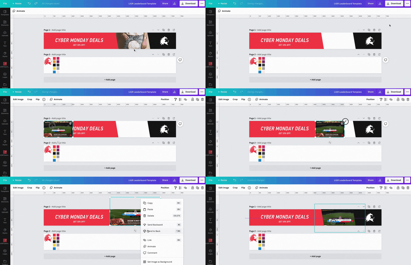
Replacing the image in a Canva template
I also made the logo slightly bigger and moved the red and black shapes further apart to allow more space for my image. You can move an element horizontally or vertically by holding shift and dragging it. Or, for fine-tuning, click it, then press the arrow keys on your keyboard to nudge the shape one pixel at a time. To change the size of an element, click and drag the corner.

My LIGR banner design with a new image showing LIGR graphics
Next, copy and paste your message into the template and adjust the text size if needed.
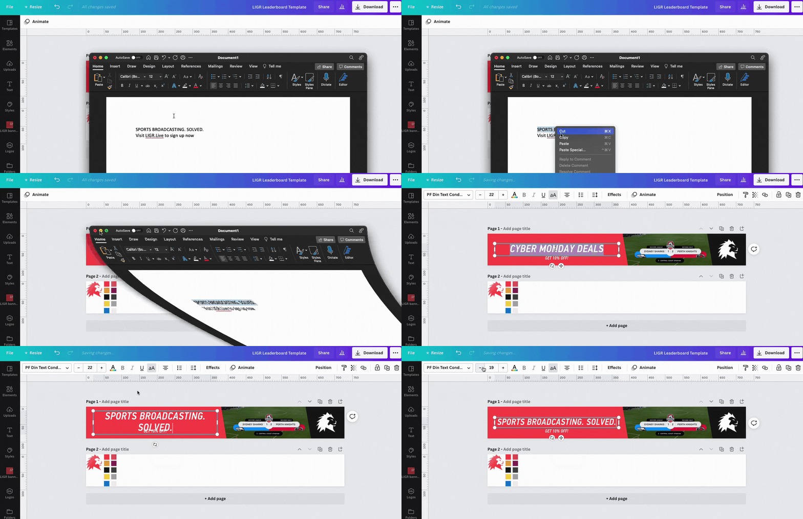
Copying and pasting text from a text file into Canva
As mentioned in my previous post, I can use the LIGR platform domain name “LIGR.Live” as the action as it’s short and easy for people to remember and type.
You could also use a telephone number, a shortcode URL if you want to send people to a longer URL or include tracking, or you can include a QR code.
I changed the second line of text to black and made the domain name bold so that it stands out. Some fonts on Canva have a separate bold weight, so the bold option is greyed out. To use the bold and regular font together on the same line in Canva, you have to make separate text boxes and position them side by side – you can’t use two different fonts in the same text box. I also increased the size of the second line.

Using a domain name as an action in ads for sports broadcasts
An action should usually come last when reading left to right, as it’s the thing you want people to do immediately after seeing your ad, so at the bottom or on the right is best. Use contrasting colors to make the action stand out.
Now all my assets are in place, I want to flip everything around to address the problem of having the logo on the right.
To do this, first press the duplicate page button to create a copy of your design. Then you can work on a new design, compare them side by side, and delete the original when you are happy.
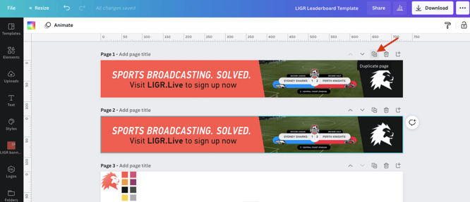
Duplicating a page in Canva
On your duplicate design, select the red shape and the text (hold shift + click) then right-click and group these items.
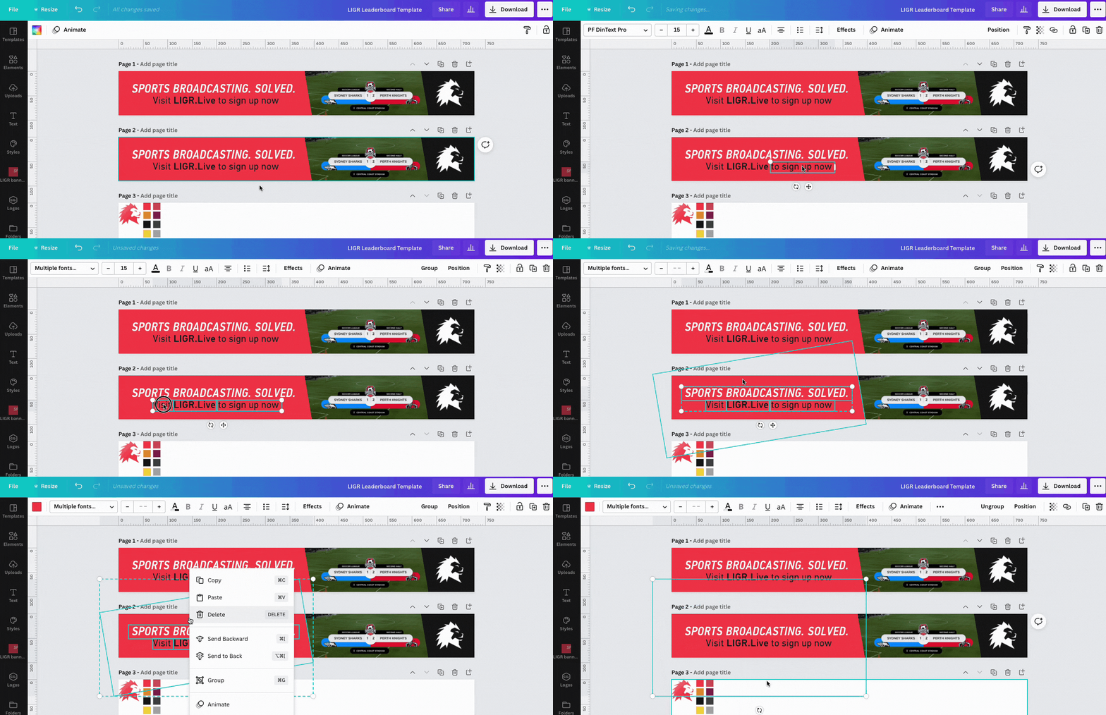
Grouping elements in Canva
Then group the logo and the black shape, hold shift and drag it all the way to the left.
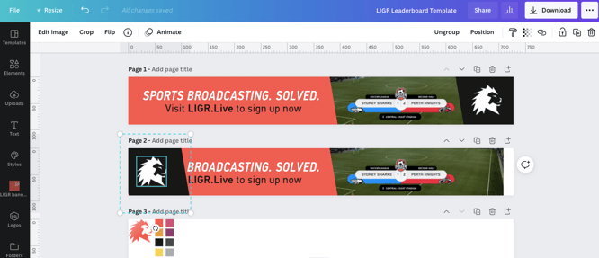
Moving grouped elements in Canva
Then reposition the rest of the elements so that everything is flipped horizontally using a combination of shift + drag, send to back, and the arrow keys. When you have the grouped items roughly in place, you can ungroup them and reposition each element.
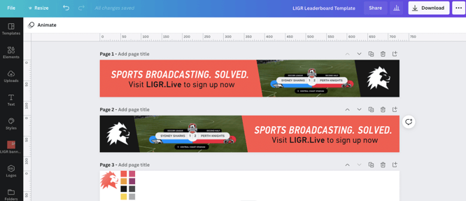
Flipping a design in Canva
Try to balance out the space so that there is equal breathing room on either side of the logo and either side of the text.
You don’t have to use guides if you’re happy to space elements by eye, but using them can help your banners look more professional.
Open the File menu and make sure Show Rulers and Show Guides are turned on.
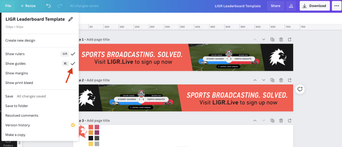
Enabling rulers and guides in Canva
You can then click on the grey rulers around the edge of the design area and drag out guidelines. I created a 20-pixel border and aligned my elements within it. (If your guidelines snap to objects when positioning them, hold down the Control key.)
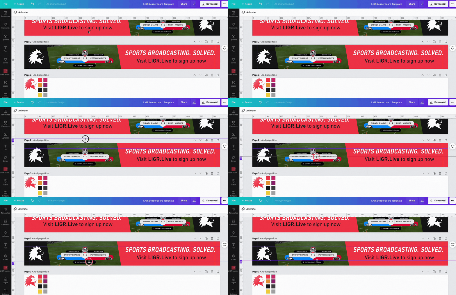
Positioning guides in Canva
When you’re happy, you can delete the pages you don’t need by pressing the small trashcan icon at the top right of each page.
You have now completed your banner.

A completed leaderboard banner design
As I mentioned before, leaderboards aren’t compatible with the LIGR platform (they are too small for an HD livestream). Remember, we started with a leaderboard ad so that we could use Canva templates.
The next step is to use your leaderboard design as a starting point to create ads in LIGR compatible sizes. This is called resizing, and you can find out exactly how to do it in our next post.
👉 Read Step 3. An In-depth Guide to Your First Banner Resize
👉 If you haven't already, read the introduction to this series: The Ultimate Guide to Creating Ads for Sports Broadcasts with Canva