
One of the biggest difficulties non-designers have when faced with the task of designing an ad is looking at a blank page and not knowing where to start. In Step 1 of our Ad Design Series, learn the best way to get past a blank page: forget about design for a moment and just gather all the assets you need.
Even if you are an experienced designer, having everything you need to hand just makes the whole process a lot quicker. You don’t get sidetracked looking for images or fonts in the middle of the design process.
But before you spend time looking for assets, there are a few things you should ask your sponsor for as soon as possible:
Digital files are best, particularly PDFs, as it’s usually possible to extract images, logos, and copy text. Even if they only have a hard copy of a brochure or leaflet, get them to take a photo and send it over as it still could be useful. If possible, do this at least a few days before you intend to design the ad so that the sponsor has some time to send you the files.
It’s important to realize that the assets you gather here might not necessarily be the ones you use in your final ad, but the whole process is much easier if you have at least one example for each of these seven items before you start. Also, even if you don’t use something, you can use it to help get a feel for a company’s communications.
There are seven things that you will need to create an ad set for sports broadcasts:
1. A logo
2. A color palette
3. Fonts
4. Design inspiration
5. A message
6. An image
7. An action
Most ad sets include all seven, but 5, 6, and 7 are optional. A message isn’t always required, a very well-known brand can just rely on its logo. Images aren’t necessary, but they are proven to help boost performance. Many ads don’t include an action but telling viewers what you want them to do after seeing the ad gives your ad the best chance of success.
I find the best way to work with Canva is to create an assets file and paste all the assets you gather into it. If you just save image files in a folder or upload them to Canva, it’s not as easy to just grab what you need. Also copying and pasting from a browser into an assets file means you don’t have to worry about image formats and resolution. You can just focus on collecting the elements you need to build your ad. You can keep your assets file open when you design your ads and copy and paste elements when you need them.
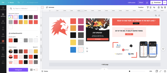
Collecting assets to help design an ad in Canva
Open Canva and create a new document, select “custom size” and enter 8000 X 3125 pixels (Canva’s maximum size) so you have plenty of space to put all your assets in.
If the sponsor didn’t send a logo, then you can usually find one on their website. Just right-click on the logo and save it as an image file (or just copy and paste it straight into Canva).
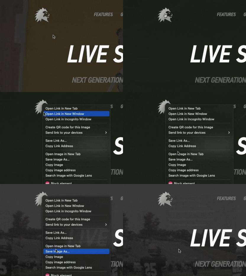
Saving a logo file in Chrome
If you do this and the logo looks pixelated with jagged edges, then you will need to try to find a logo from a different source or keep the logo at the same size in your ads as it appears on the website. Without getting too bogged down with image resolution, you want the logo file to be as big an image as you can find, so that you can scale it and not see the pixels.
![]()
A low-resolution logo (left), a high-resolution logo (right)
If you managed to get a PDF brochure or leaflet, then you can also try copying and pasting the logo. PDFs are often designed to be printed, so the logo may be higher resolution than a logo used on a website.
You can also Google “[company name] logo transparent png” and use the search tools to find large or medium size images. You want a transparent PNG so that you can use the logo on any color background.
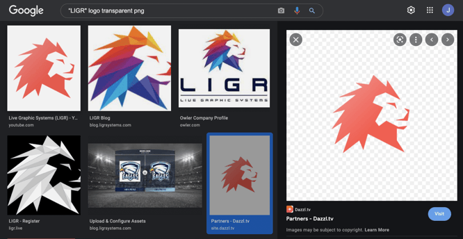
Using Google’s image search to find a logo with a transparent background
When you copy the image, make sure you’ve clicked on the thumbnail first and the full-size image is displayed in the right pane. (Otherwise, you’ll save the thumbnail image, which is low quality without a transparent background). Also, be careful not to use an out-of-date logo (the multicolored logo is LIGR’s old logo). Make sure the logo is the same as their current logo on their website or any other materials you have.
The preview pane on the right can also help you to find the right logo. There will be no pixelation in the preview pane (the edges of the logo are crisp and smooth) and the background of the image will be a grey and white checkerboard. Your browser adds this checkerboard behind the image to show that it has a transparent background.
You want to find a logo with a transparent background so that you can use the logo on top of a colored background or image.

A LIGR logo with a transparent background (left) and with a white background (right)
If you do find a large image file, but it doesn’t have a transparent background, you can still use it, it just means you will have to use the same background color in your ad so that the logo doesn’t appear in a white box.
You can also use Google’s advanced image search to specifically look for logos used on the sponsor’s website. Enter “logo” in the “all these words” field, select “large” or "medium" under “image size” and enter the domain of your sponsor’s website in the “site or domain” field (“ligrsystems.com” for example).
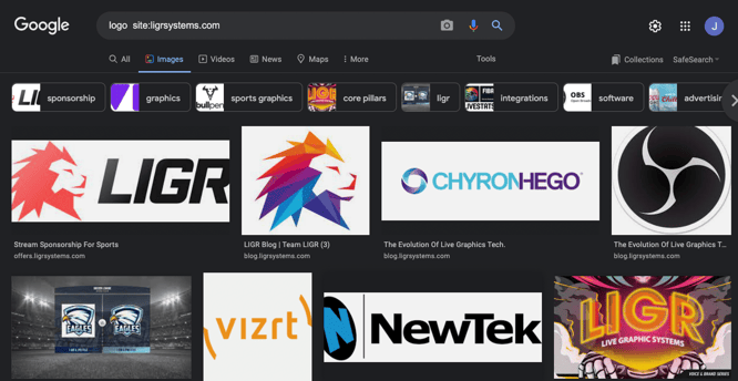
Google’s advanced image search
Unless you’ve been given a specific color palette to use by your sponsor, you’ll need to work out which colors you are going to use for your ad. You can easily grab colors from any files you’ve found or been sent, like a logo, any digital materials you have, their website, or an existing ad.
If you’re using Canva pro, then you can learn how to create a color palette in this tutorial video from Canva. If you’re using the free version, then the color palette is limited to just three colors (but using an assets file will allow you to get around this).
Then you can just copy and paste these colored squares when you need them.
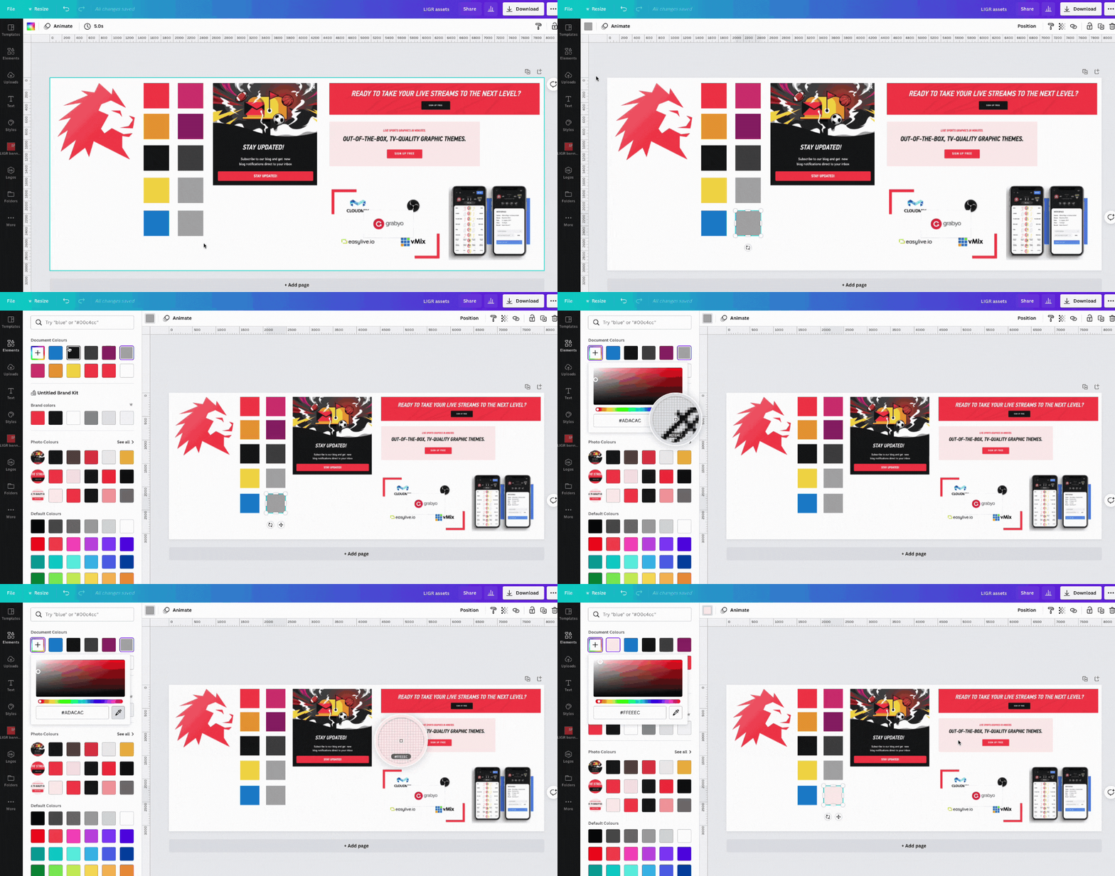
Using the color picker tool in Canva
If the sponsor hasn’t supplied an official font you have some options:
To find out which fonts a website uses, using Chrome browser, highlight the text, right-click and select “inspect”.Then, look for “font family” under “styles”. The LIGR website uses the fonts PFDINTextPro and PFDINTextCondPro.
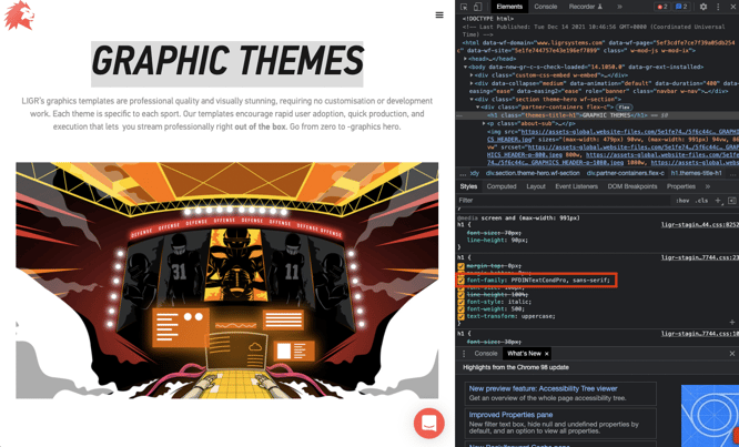
Using Chrome's "inspect" tool to find the name of a font
Do a Google search for the fonts and find out if they are free or if they require a license.
If you have a Canva pro account, download any free font files and then upload them to Canva. You can also do this if the brand you are working with sent you any font files.
Many fonts are licensed so you can’t just use any font file. If you’re working with a brand and they send you their brand font files to use, that usually means that they have purchased the font and they are licensed to share it with other businesses who are creating designs on their behalf. If in doubt, it’s best to check.
If you’re just using a free Canva account, or you want to avoid any licensing problems, then you’ll need to find a similar-looking font from Canva’s free fonts.
Generally, if you’re working for an established national or international brand, you will probably have to use their fonts in your ads. But if you are creating ads for a local business without established brand guidelines, then it’s up to you to choose a font.
When you’re starting out, it’s easy to get bogged down in font selection. This can stop you from designing the ad and waste a lot of time. It’s better to just pick a simple, easily readable font, design the ad, then try different fonts when you’re finished instead of spending time picking the perfect font before you’ve started.
Clear Sans is a good serif font to use on Canva as it has three different weights. Inria Serif and PT Serif are good options for a serif font.
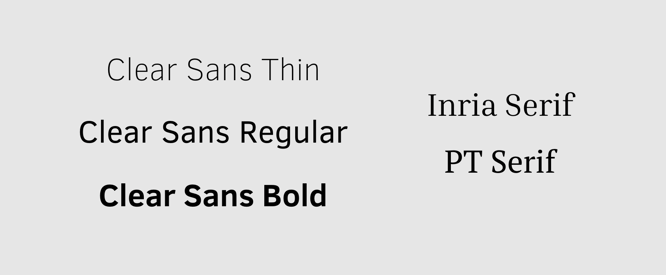
Free fonts available in Canva
You can search for these fonts in Canva on the text tab.
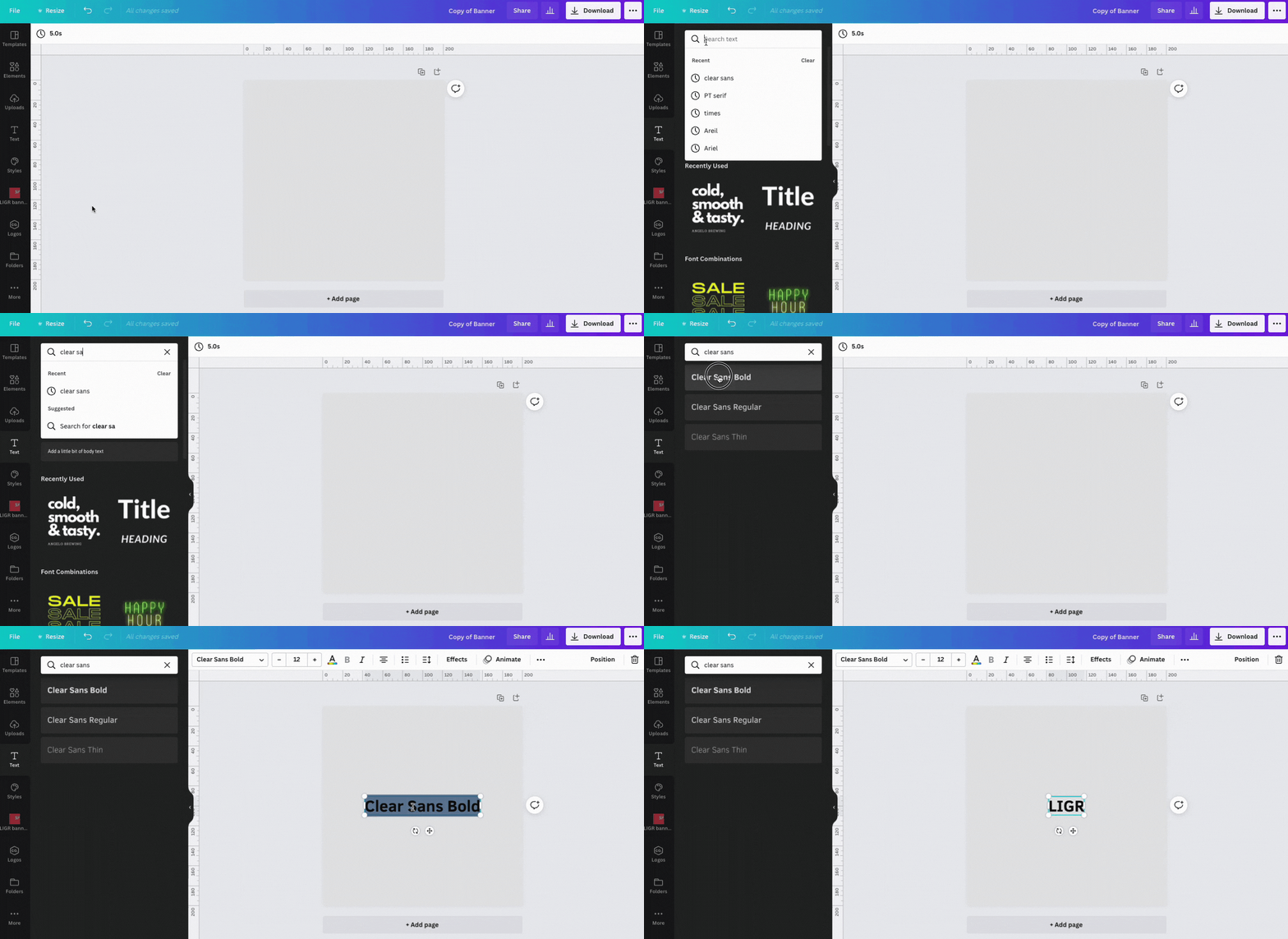
Using Canva’s text tab
You might be tempted to use some of Canva’s more flamboyant fonts, but it’s usually best to stick with something plain and readable as banner ads are only shown for a short duration and people aren’t always 100% focused on them. You want to make reading as quick and instinctive as possible. As proof of this, look at billboard ads around any sports match. They nearly always use simple fonts.
Look at the brand’s website, brochure, or any materials you have for inspiration. You should look for any design elements that could help you to design your ad.
The LIGR website uses flat block colors – mainly red, white, and black.

You can find inspiration for your design on your sponsor's website
This subscription popup almost looks like a banner ad. It would be easy to recreate this design in Canva and use it with any image.
Also, note how your sponsor uses text. LIGR has all its headlines as bold italic capitals, while paragraphs are sentence case (capitalized first letter) and text within buttons are bold capitals.
Screenshot any design elements or layouts that you see on the company’s website and paste them into your Canva assets file. You can scale the elements to fit and add more pages if you need more space (press the “+ add page” button at the bottom of the screen). You can also update your color palette with any new colors that you find.
The screenshots you’ve collected from the company’s website won’t actually be used in your ads, you will need to recreate any design elements you want to use with Canva’s simple design tools. If you’re familiar with adding shapes in PowerPoint, then you’ll have no problem using Canva’s tools. Here’s a tutorial that walks you through making shapes within a Canva file (you’ll need a Canva account to use this tutorial).
If you’re not comfortable with this or you want to create an ad set as quickly as possible, you can use a Canva template instead of designing an ad from scratch.
Choosing a message for your ad can be tricky, but again, you just want to keep it simple. Look at your sponsor’s website again, this time copying and pasting any interesting promotional messages into a text file.
Search for the brand on Google as they might be running ads that you can use for inspiration. Sign up for the brand’s promotional emails or ask them to forward their latest emails to you. Look at their social media accounts and see what promotions they are running. Grab any headlines from their website, emails, or brochures that could be used or adapted for your ads. Anything short that will grab attention. Ideally, you want a three to five-word headline and a second line of around 5-10 words that supports the headline.
Of course, if the brand has something they actively want to promote or a product they want to advertise they may have already given you a message. If you’re completely stuck for a message, you can try things like “[product they sell] in [location]” or “[product they sell] only [price]”.
Also, think carefully about the company that you’re advertising. If it’s a brand that your audience knows about, then you don’t really need to explain too much. If it’s something new or niche like LIGR, then it’s good to include an explanation for people who aren’t familiar with the company and its products.
Don’t worry too much if these messages don’t make sense if they are taken out of context. Just gather as many interesting messages as you can, then you can edit them later so that they make sense in an ad.
Ads with images perform better, especially images that include happy faces. But don’t just pick any image that people will immediately know is a free stock image. Try to find something that is a good fit, or better still use an image from the brand’s website.
Although people and faces work better in ads, this doesn’t always fit with the brand. For example, LIGR never uses images of people, so it’s better to stick with this rather than add a strange image that doesn’t fit.
Collect any images you can find and drop them into your assets file. Again, don’t think too much about it at this stage.
Pro tip: keep a note of where you found each image, whether it’s from their existing communications or a free stock image. You might need to tell your sponsor where you found the image so that they can check usage rights. Just because a company used an image once, it doesn’t mean that they have the rights to use it again elsewhere. When you ask for sign-off on your design, tell them where you got the image from and ask if you have permission to use it.
A great way to find images is to use Google’s advanced image search within the company’s website domain. To do this, enter the website of the brand under “site or domain”.

Searching within a domain with Google's advanced image search
You can look for any appropriate images in Canva’s built-in stock image library. With your assets file open, go to “elements” on the left-hand menu and select photos. I searched for terms like “sports broadcasting”, “Broadcasting”, “video editing” and some others but I couldn’t find anything appropriate for my ad.
Image hosting platform Flickr has a dedicated Creative Commons search page where you can find public domain images that are free to use, even for commercial purposes.
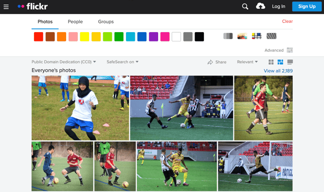
You can find free public domain images on Flickr
At this stage, you just want to grab a few images and add them to your assets file. You can always go back and find more images after you’ve designed your ad, but it’s good to collect a few before you get started so you can see how it looks when you drop them into your template.
Ideally, every ad campaign should have an objective. We don’t want to get involved with strategy here as this is a design tutorial, but the action that you want people who see your ad to perform should be informed by the objective.
The objective for my LIGR ad is to get new users to sign up. The best way to do this is to ask them directly to sign up and then give them an easy way to do it (visiting the LIGR Live website).
Think about your sponsor and their products or services and what the objective should be, then create an action that gives viewers the easiest way to do that. Either visiting a website, visiting a real-world location such as a store, or calling a phone number. Again, you can look at the sponsor’s existing communications and see what they usually do.
Since there are no clicks or links within ads on LIGR, we need to choose the best way to get people to visit the LIGR site and sign up.
We could use a QR code, a shortcode URL, or ask them to search for a particular term that we know will find the LIGR website, for example, “live sports graphics”.
The LIGR platform already has a very short URL, so we can just ask them to “Visit LIGR.Live to sign up now.”
Now you have your assets ready, the next step is to design your ad in Canva.
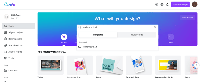
Using Canva’s leaderboard banner ad templates
Canva’s templates can help inexperienced designers get over the challenge of starting with a blank page and quickly create banner ads. Just choose a template and then swap out the assets that you collected in step 1.
👉 Read Step 2: Design Ads the Easy Way with Canva Templates
👉 If you haven't already, read the introduction to this series: The Ultimate Guide to Creating Ads for Sports Broadcasts with Canva