

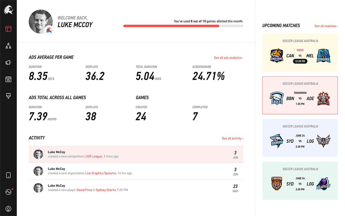
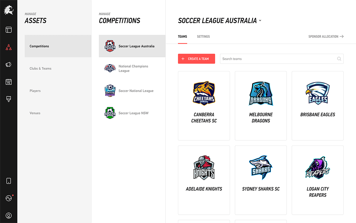
 Creating a brand that stands out for all the right reasons is a difficult endeavor. Part of LIGR's product appeal is that we provide polished professional graphics, and our brand needed to reflect that.
Creating a brand that stands out for all the right reasons is a difficult endeavor.
Fortunately, when I looked at the sports live stream industry, I knew that LIGR could stand out by having pleasant aesthetics. Unfortunately, a nice looking brand and product would not make us stand out enough to place us alongside some of the best brands and apps out there.
My first task when I joined LIGR was to redesign the flagship product from the ground up. Built-in with designing the product is its visual look, and the first version looked as sad as a benched player.
 LIGR version one in all its glory!
Staring at a blank screen is daunting, and the limited time frame meant there was no time to explore every possibility, so I set constraints for myself. I came up with a list of all the words I want evoked when the audience saw LIGR:
These were things that I wanted, and things that are absent from the other apps. I also looked at the latest design trends, looked at some of the most beautiful apps out there, and explored themes to find LIGR’s visual voice.
From my perusal, I noticed that some of the best designs go for a kind of muted beauty where the product speaks for itself. This seemed good to me. After all, Dieter Rams once said “Good design is as little design as possible. Less, but better.” Yet, an invisible design needs to look as if it belongs in its environment for it to be truly invisible. I needed to make it feel like it belongs in some sort of idealized image of sports that exists in people’s minds and blend it with the latest trends in app designs, but it also needs to simply be in the background and not be distracting.
“Good design is as little design as possible. Less, but better.” —Dieter Rams
As a designer, I’m obligated to quote Dieter Rams, lest I anger the design gods.
I explored vibrant colors inspired by team logos and jerseys. For typography, I looked for tall condensed typefaces to give it a sporty feel. There’s no shortcuts in this stage. I created many combinations of colors and typefaces to see what they looked like. In the end, we went with a blood-pumping red to go for a bold color, and I incorporated italic text to give a feeling of motion and reinforce the energetic red color.
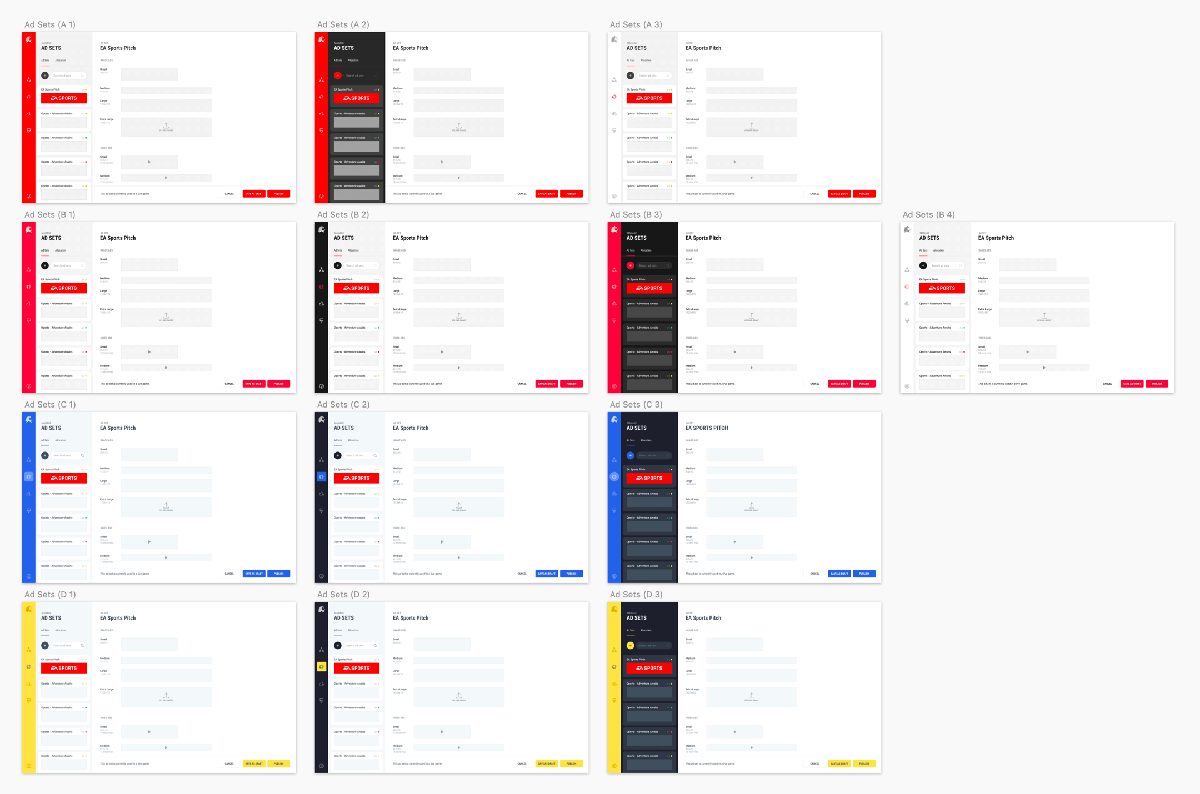
 The good, the bad, and the fugly.
In the end, I felt the app looked like it was sporty, modern, clean, simple, bold, energetic, and best in business. The only key word I failed to incorporate was “live stream”, but who even knows what a “live stream” looks like anyway? In the future, hopefully people will think of LIGR when they think of live streams.
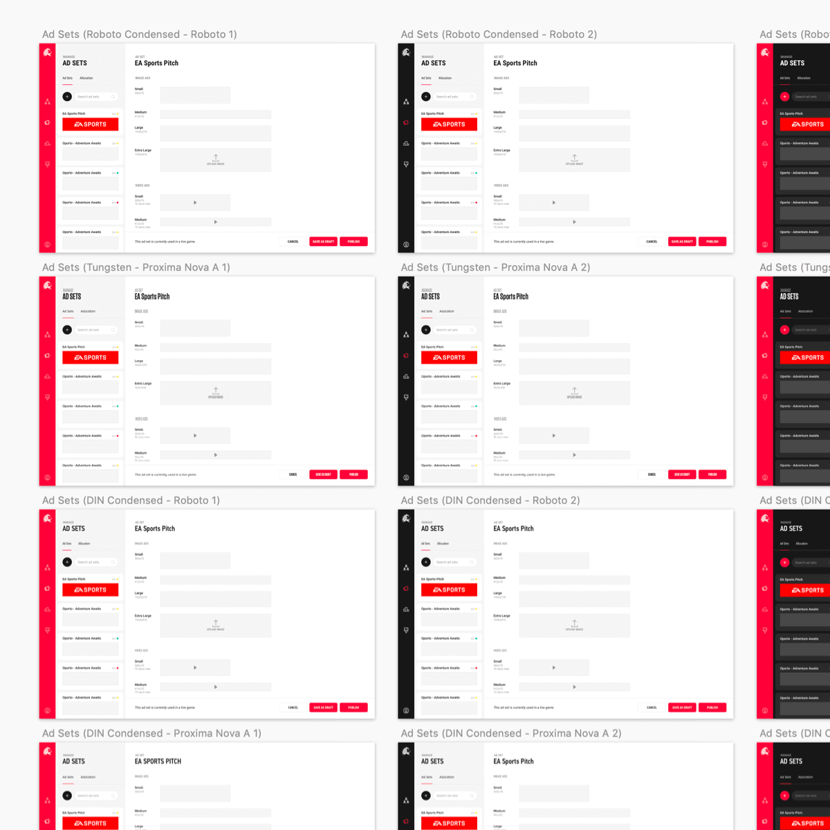
 Wow, so invisible.
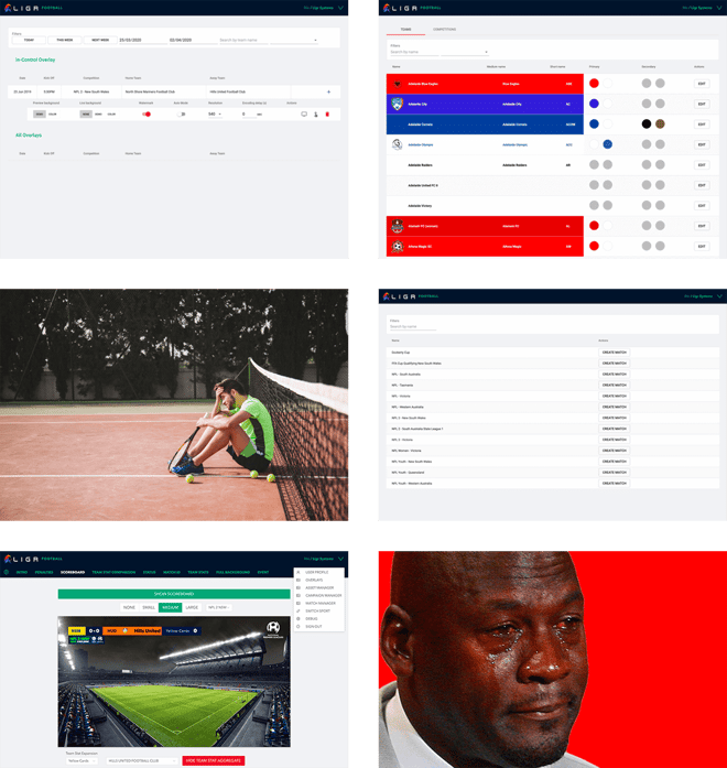
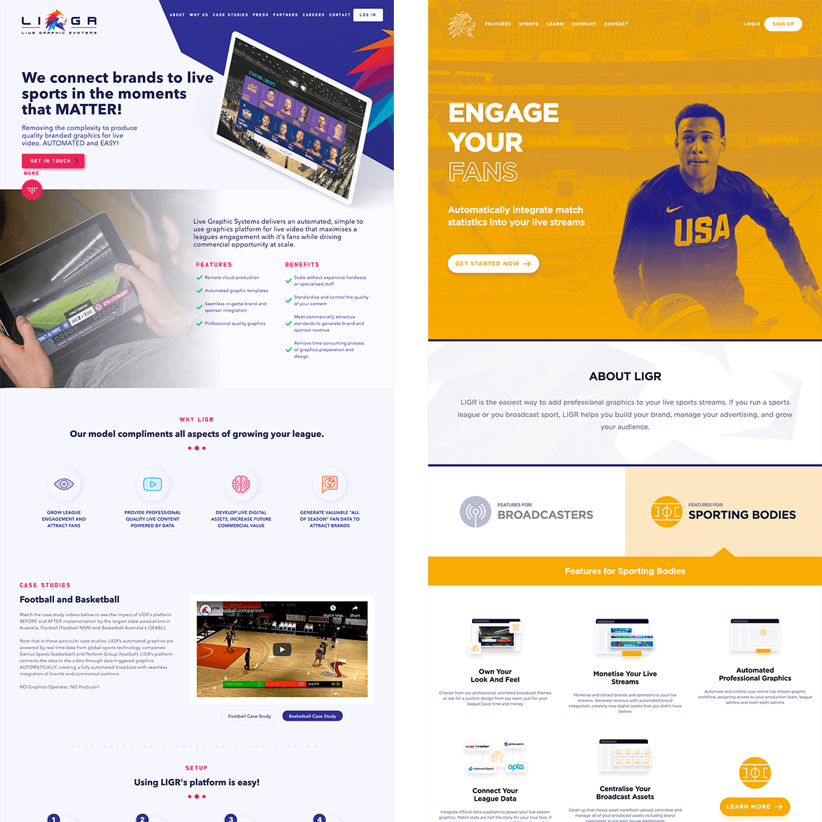
Like the v1 product, our old website was looking tired. The brand was in dire need of a jolt of energy, like the Patriots needing Tom Brady with 2 minutes left in the game, or the Bulls needing Jordan in the 4th with the shot clock plummeting down, or a designer with a pending deadline needing a Dieter Rams quote.
 Old websites.
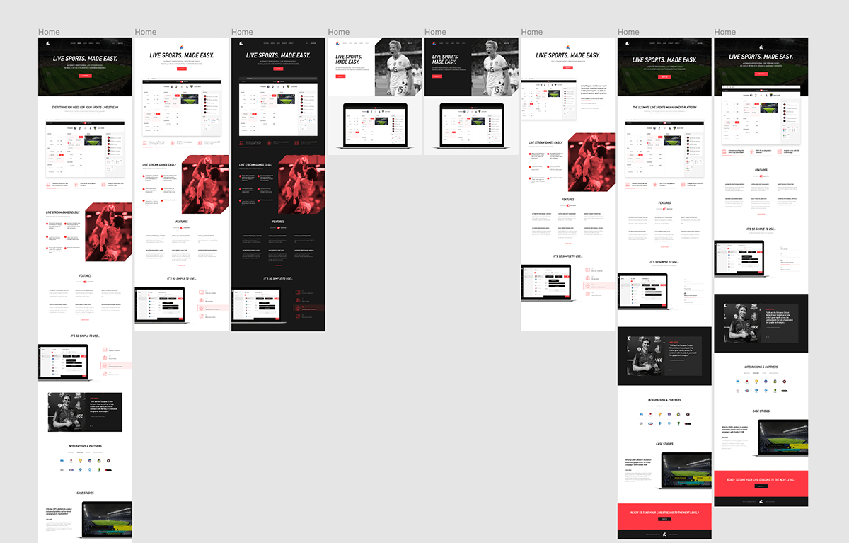 Early drafts of the website. One of our problems was totally not the fact that our CEO wanted to tweak the content every other day.
I needed to ensure the company brand and website would match the product. However, unlike the product, part of the purpose of a website and a brand is to be noticed, which, if you recall from earlier, is the exact opposite of our product’s design.
To solve this contradictory problem, I knew I needed to incorporate imageries to make the brand more visible, and use subtle design elements to break the monotony of the design. With that task set in my mind, I went back to browsing for inspiration.
My ideas were still pretty vague at this stage. All I knew was that our photography should use action shots whenever possible to give a kinetic feel. That aside, I didn’t really know what I wanted for our illustrations, but it didn’t take long for me to know what I didn’t want. A quick browse through dribbble and Behance, and I was inundated with the same illustration style over and over again. It was so prevalent that I feared I might catch it like a virus, and then Coach would bench me.
 The illustrator must be making a killing illustrating every single website out there.
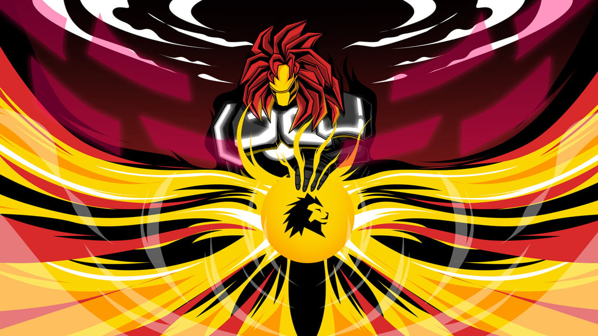
Going back to the list of key words I wanted to evoke, for the brand I wanted our illustrations to carry that same bold and energetic theme, but I wanted it notched up to give it a futuristic hyperrealism feel. While other companies are following current trends, I wanted LIGR to go bold and stand out from the pack, so we went with a dynamic illustration style with vibrant colors that combined elements of cyberpunk, animes, sports, and futurism.
Part of our product’s appeal is that we provide polished professional graphics, and our brand needed to reflect that beyond the UI. Through robots, ligers, vibrant colors, and energetic action lines, the brand has a unique feel not only against our competitors, but against any brand as a whole.
Time lapse video of our illustrator creating one of our illustration pieces.
The designs aren’t perfect. All those wordy headlines written in all caps on the website make it seem like we’re screaming all the time. You know, like those times when we’re watching referees missing fouls in a game. In hindsight, that’s probably not a good idea. All the grey text is also a killjoy. Those minor fixable things aside though, I’m quite happy with the outcome, and the future of sports live streaming looks bright.

|

|


